Client
The OSI Charity Fund (“Society for the Promotion of Arts”) supports and enhances the competitiveness of art education, the development of the creative ecosystem, creates projects aimed at increasing the attractiveness of the creative industry, and increasing its contribution to the Russian economy.
Task
Our task was to develop an identity that would be original from a visual point of view but would possess artistic elegance and usability. After all, it was intended to be used by people professionally engaged in art but lacking design skills. In addition, the visual language of the OSI should be understandable to two very different audiences of the Fund—patrons and industry representatives. The latter include project leaders in art education, independent professionals in art education, young artists and curators, graduates of art universities and continuing education programs, and artistic associations.
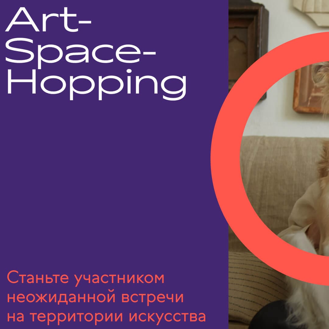
Art magnetism is a concept of personality focused on the idea of creating new experiences, forming new connections, and exploring new possibilities. It emphasizes the importance of being open to change and embracing new ways of thinking and existing in order to constantly develop and evolve as a person.
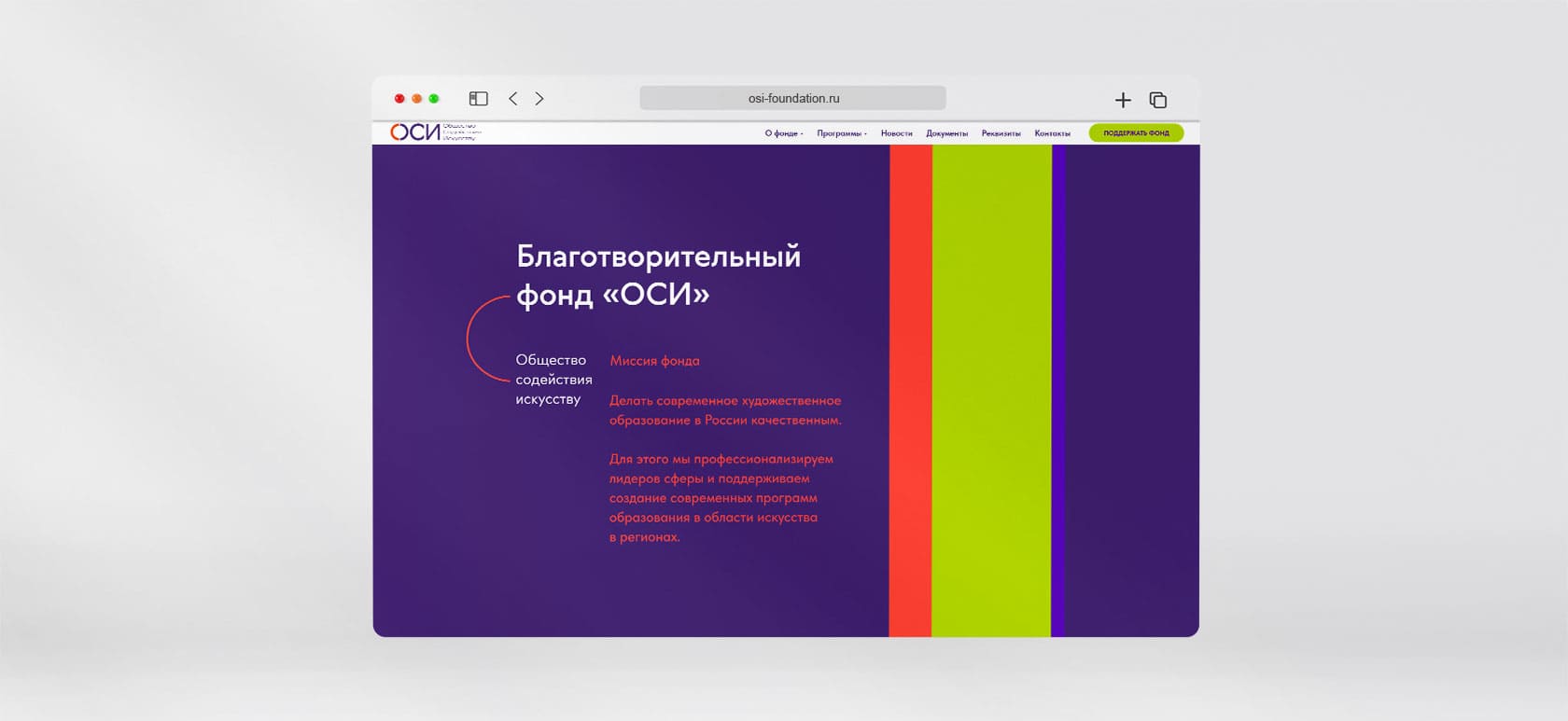
The mission of the fund is to make contemporary art education in Russia high-quality, to enhance the professionalism of leaders in the field, and to support the creation of modern art education programs in the regions.
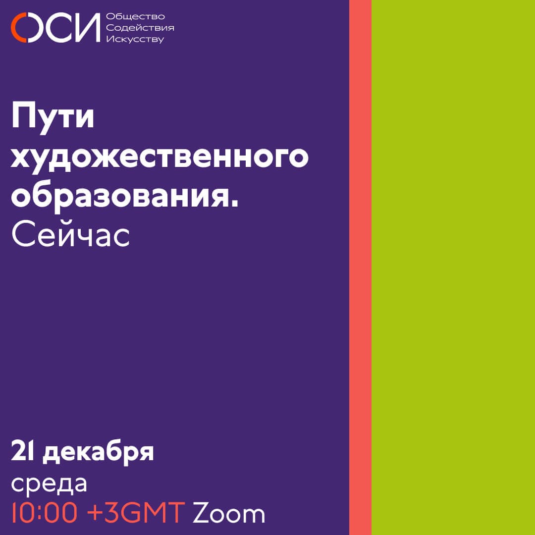
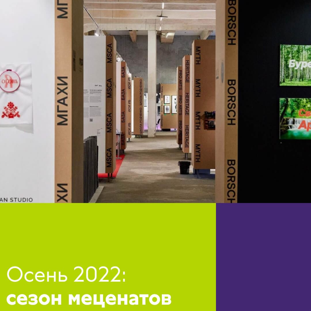
For example, the first curatorial program— “Now”—will develop the professionalism of specialists—leaders, directors, and curators of additional art education programs.

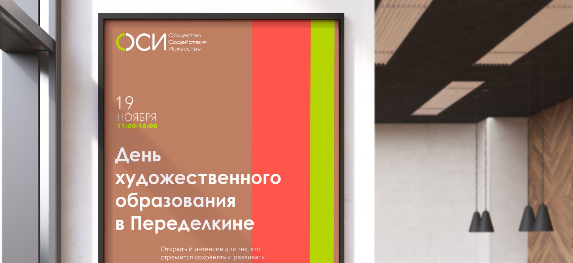
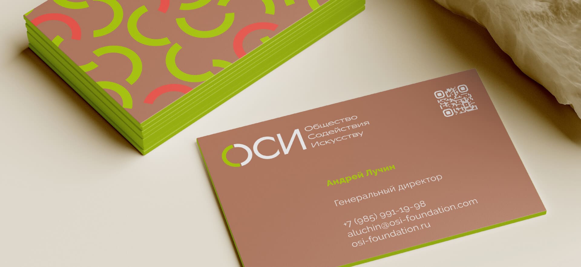
At the core of the layout system are columns in which, depending on their width, text, photos, or a branded pattern are placed. This flexibility expands the variability of use, creates a flexible, dynamic grid, and a recognizable identity of the fund.


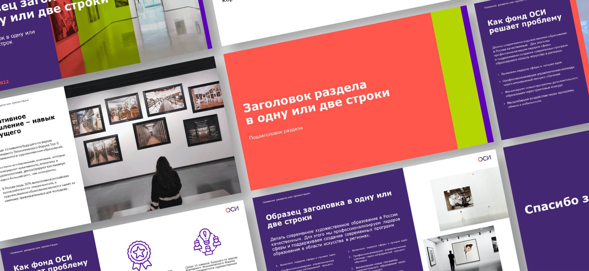

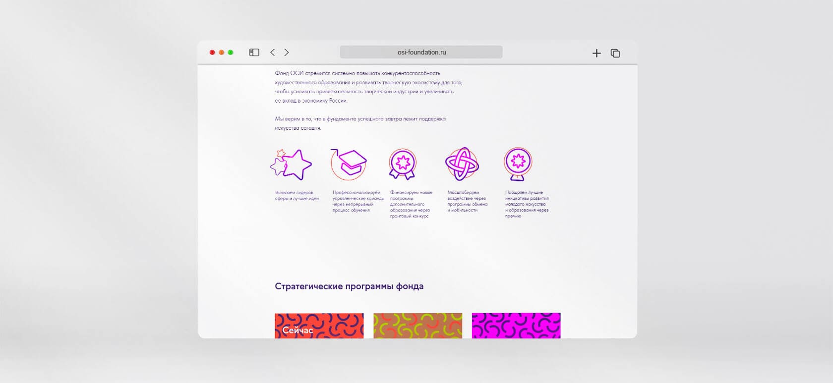
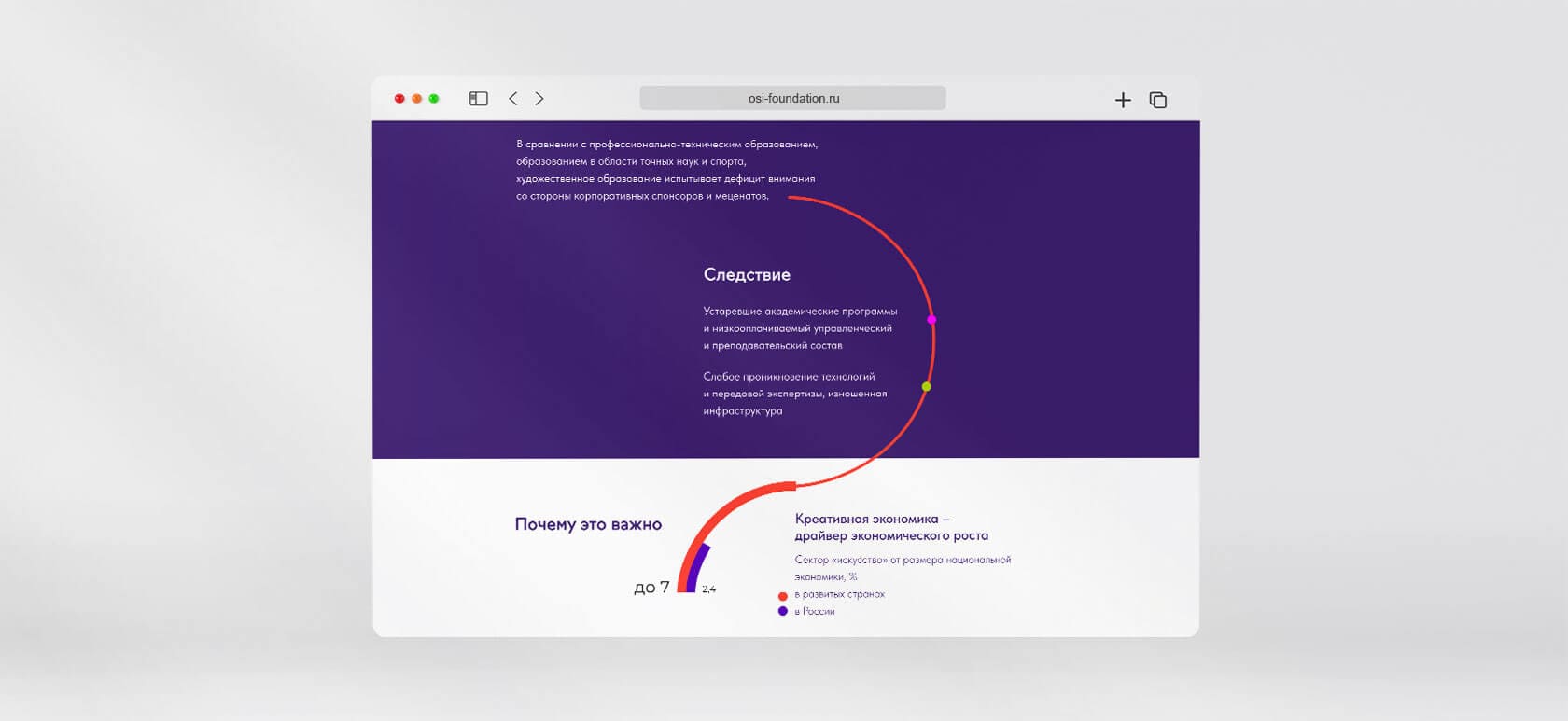
We used the maximum capabilities of our grid to make the site minimalistic and readable on any device. At the same time, a large amount of information important for the fund was made readable and structured. Corporate colors are used only in page headers, additional elements and contrast blocks. With the development of the fund, the site will be filled with photographs of heroes and events, which will further decorate and enliven it.

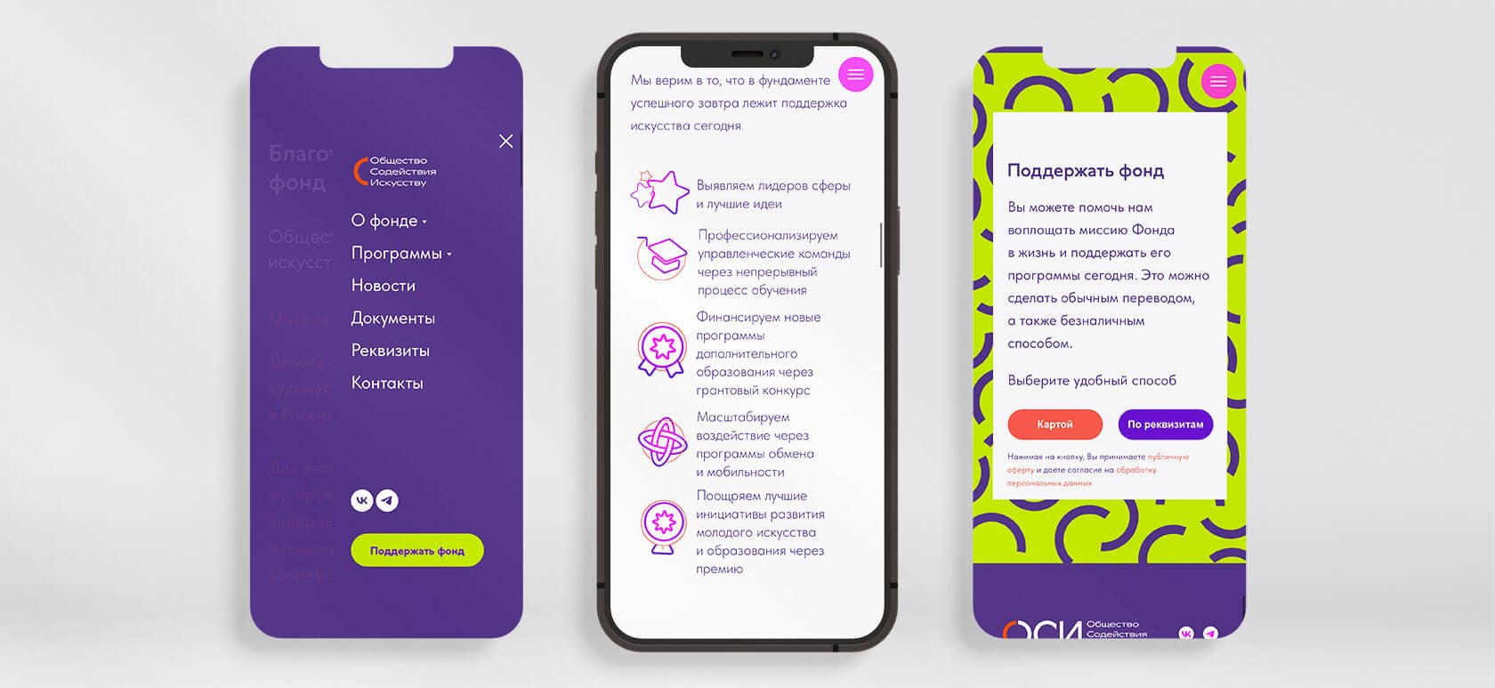

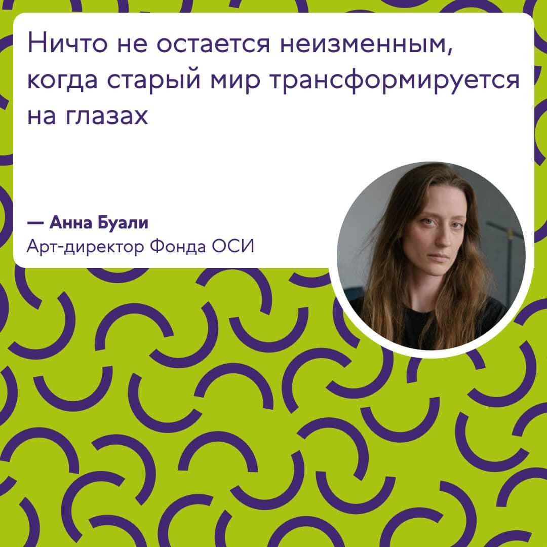
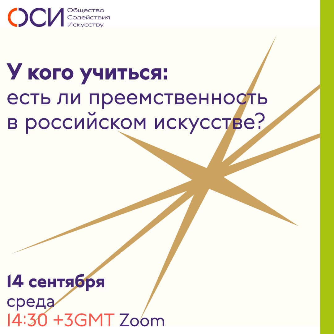
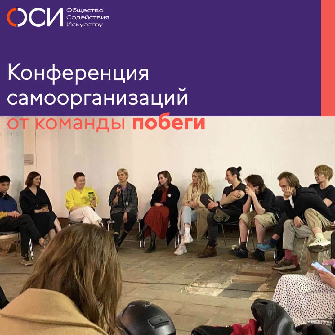
For social networks, we developed a flexible approach that takes into account the diversity of content formats and the variability of the brand palette. The more photo content and different formats used, the better, but with colors, we must be stricter. Three colors will allow us to stay within the identity framework without turning the content into a riot of color. In the future, colors can be changed, adding variability and refreshing the visual presentation.

Philanthropy and culture have always relied on the “good will” or pro bono participation of interested individuals and companies. Otherwise, it has never worked. Thus, the OSI Foundation is built on mutual exchange and the sharing of common values with patrons and companies. Design and branding are a key opportunity to express the character of the foundation, its idea, and history. “Mikhailov and Partners” acted as visionaries and partners who deciphered the foundation’s code and created a visual language understood by both culture and business. We are very pleased to have the opportunity to work together.
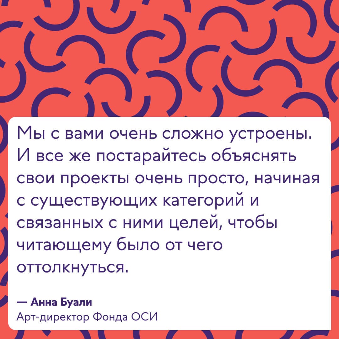
Anna Buali, Art Director of the OSI Foundation